Master the luxury design principles that high-end interior designers use to create showroom-quality console displays — and teach your clients how to achieve that elevated aesthetic, increasing your design credibility and project value.

Luxury is not a function of price. It is a function of intention. A console table display that communicates restraint, proportion, and material confidence will read as expensive in any context — and that perception translates directly into design fees and project values.
Why Console Tables Are Your Secret Weapon for Design Upselling
Here is a number worth understanding: according to Contravision’s visual merchandising research, strategically designed displays can increase product sales by up to 32%. In a furniture showroom, a single well-executed console table vignette — costing $400–$700 to style — can anchor a $15,000–$40,000 whole-room design commission.
That is not a hypothetical. It is the documented outcome when showroom operators, distributors, and interior designers treat console table styling as a professional discipline rather than a decorative afterthought.
The challenge is that most B2B furniture businesses — distributors, showroom operators, agents — spend their knowledge investment on sourcing and logistics, and leave their physical and digital presentation to instinct. The result is showrooms where beautiful furniture sits in isolation, stripped of the context that makes it commercially compelling.
This guide changes that. It gives you a systematic, teachable, repeatable formula for creating console table displays that convert browsers into buyers, elevate your design credibility with professional clients, and turn individual piece sales into whole-project commissions.
Every section is written for the professional who works with B2B clients: interior designers building project portfolios, hotel fit-out specialists specifying complete environments, showroom operators competing for design-firm loyalty, and distributors who need their products to perform in client-facing settings they do not fully control.
Understanding the Psychology Behind Luxury Console Styling
Why Your Clients Pay More for “Expensive-Looking” Spaces
Clients paying premium design fees are not paying for furniture. They are paying for a visual outcome — a room that communicates a specific social and aesthetic signal to everyone who enters it. The signal they are buying is: this space belongs to someone with discernment, resources, and taste.
Console tables are uniquely positioned to deliver that signal because they occupy the most psychologically charged position in any room — the threshold between spaces. An entry hall console is the first piece of furniture a guest encounters; a living room console behind a sofa is the visual full stop of the main seating arrangement. These are positions of disproportionate visual influence.
The psychology is straightforward: a well-styled console table sets the perceived quality ceiling for the entire room. Walk into a space where the console table is impeccably proportioned, deliberately edited, and materially coherent, and every other piece in the room benefits from the halo effect. Walk into a space where the console is cluttered, disproportionate, or under-considered, and the same effect works in reverse — dragging down the perceived quality of far more expensive surrounding pieces.
For your designer clients, this means that mastering console styling is not an aesthetic luxury — it is a commercial lever that protects the perceived value of every other specification in their project brief.
The Three-Layer Framework: The Design System That Separates Good from Luxury
The three-layer formula is the organizing principle that separates professional-grade styling from well-intentioned amateur arrangement. It is used, often intuitively, by every designer whose work reads as “elevated” rather than merely “nice.” Made explicit, it becomes a teachable, scalable system.
The three layers are: Foundation (the surface itself, proportion, and negative space), Statement (the anchor piece or pieces that command visual attention), and Refinement (the finishing details that add texture, narrative, and tactile interest).
Each layer has a specific function. Remove any one of them and the display degrades: without the Foundation, nothing is proportionate; without the Statement, nothing commands; without the Refinement, nothing engages at close range. Together, they create a display that works at every scale — from across the room to within arm’s reach.
How to Position This Knowledge to Your Design Clients and Showroom Visitors
The commercial framing of this formula is as important as the formula itself. You are not teaching clients to decorate — you are teaching them a professional design system that they can apply across their projects and explain to their own clients. That positioning elevates the conversation from “what should I put on the table?” to “how do I create a room that reads as luxury?”
For showroom staff, this language shift matters enormously. A team member who can walk a client through the three-layer formula while standing in front of a display is demonstrating expertise. A team member who says “we styled it this way because it looks nice” is demonstrating nothing. The difference in client perception — and in the probability of an upsell conversation — is substantial.
Layer 1 — The Foundation Layer (Functional + Visual Balance)
What Goes on the Surface: Creating Intentional Negative Space
The first and most commonly violated principle of luxury console styling is this: empty space is not wasted space. It is design space.
Amateur styling fills. Professional styling edits. The difference is visible immediately — an over-filled console table reads as anxious, as if the designer was afraid silence would be misread as neglect. A well-edited console, with deliberate negative space between objects, reads as confident. That confidence is the primary signal of luxury.
Negative space — the unoccupied areas of the table surface — does three things: it allows each object to be perceived individually rather than as visual noise; it creates visual breathing room that makes the display feel considered rather than accumulated; and it communicates that the designer is secure enough to let the table do less.
For B2B clients — particularly designers presenting to developers or hotel groups — this principle is commercially important. A staged room with an over-styled console table photographs poorly, reads as low-end in digital presentations, and undermines the overall specification pitch.
The Math Behind Proportion: Why 60% Empty Space Matters More Than You Think
The principle of approximately 60% negative space on a console table surface is derived from the same proportional logic as the Golden Ratio — the mathematical relationship (1:1.618) that appears throughout classical architecture, fine art, and nature, and that trained eyes recognise as intrinsically balanced.
Applied to a console table, the golden ratio principle suggests that approximately 60% of the table surface should remain visually unoccupied, with objects grouped in the remaining 40% in a way that creates height variation and visual flow. This is not a rigid rule — it is a calibration guide that ensures displays feel spacious rather than crowded.
In practice: a 140cm console table has approximately 56cm of “active” surface when this principle is applied. That 56cm should contain a maximum of three distinct grouping zones, arranged at varying heights to create visual rhythm.
How to Select the Right Console Table Base for Your Client’s Aesthetic
The table itself is the foundation — and its selection determines the ceiling for everything placed on it. A console table with excessive ornamentation competes with its own styling. A console with clean architectural lines becomes a platform that elevates anything placed upon it.
The most commercially versatile console bases for distributor and showroom inventory are those with architectural restraint in their silhouette — whether modern, traditional, or industrial in character — combined with genuine material quality that reads well at close range. A marble top with a brushed brass base, a solid oak top with hand-forged iron stretchers, a lacquered surface with architectural steel legs: all of these provide a stable foundation for three-layer styling without competing with the objects placed on them.
Jade Ant Furniture’s console table range is designed with exactly this balance in mind — architectural clarity in form, genuine material quality in execution, and proportions that work as foundations for professional-grade styling.
Strategic Placement Principles That Showroom Designers Use
Position determines perception as much as styling does. A console table placed against a blank wall in a corridor receives a fundamentally different visual reading than the same piece positioned at the end of an enfilade or centered beneath a substantial mirror.
The principle is backdrop amplification: the surface behind and above the console table is as important as the table surface itself. A large architectural mirror, a gallery wall, or a single oversized artwork anchored to the wall above transforms the console from a piece of furniture into a composed vignette. That vignette — the console and its backdrop together — is the design unit, not the table alone.
For showroom operators, this means investing in the wall treatment behind your console displays as actively as you invest in the pieces themselves. The return on a $300 vintage mirror framing a $2,800 console is visible in the photography, in the client response, and in the average transaction value of sales initiated from that display.
Asymmetrical vs. Symmetrical Layouts: Which Sells Better to Your Clients
Symmetrical console table layouts — mirrored objects on either side, centred anchor piece, identical height on both ends — communicate stability, formality, and classical order. They are appropriate for traditional and formal transitional projects: grand entry halls, heritage hotel lobbies, formal dining room sideboards. They photograph predictably and are easy to replicate across multiple rooms.
Asymmetrical layouts — one tall anchor element on one side, lower grouped objects on the other, deliberate visual tension between the two — communicate sophistication, editorial confidence, and contemporary design awareness. They are appropriate for modern and design-forward projects and photograph more dynamically for portfolio and marketing use.
The commercial insight: asymmetrical layouts consistently generate more organic social media engagement than symmetrical ones, because they create visual movement that invites the eye to explore rather than confirming a static expectation. For designers building their Instagram presence and for showrooms driving digital engagement, asymmetrical is typically the higher-performance choice.
Depth and Height Variation: Creating Visual Interest Without Clutter
A console table display styled entirely at the same height reads as a flat line — visually inert regardless of the quality of the individual objects. Introducing height variation — one tall element (a lamp, a branch in a vessel, an architectural candlestick), one mid-height element (a stacked art book with a small sculptural object on top), one low element (a tray, a small sculptural vessel) — creates a visual rhythm that the eye travels along rather than scanning flatly.
Depth variation matters equally. Objects placed at the front, middle, and back of the table surface create a three-dimensional composition that reads with genuine spatial interest, particularly from the primary viewing angle (typically slightly elevated, from standing height, 2–3 meters distant).

Height variation is the single most effective tool for creating visual interest without adding objects. Three elements at different heights read as a composition; three elements at the same height read as a row.
Layer 2 — The Statement Layer (The Anchor Pieces)
Selecting Anchor Objects That Command Attention
The statement layer is the visual centre of gravity of the entire display. It is the element that a person registers first from across the room, that orients the eye before it explores the refinement details, and that communicates the overall aesthetic intention of the display.
An anchor piece has three characteristics: scale large enough to register at distance, visual weight (through colour, material, or form) that commands attention without aggression, and design integrity that holds up to extended close-range scrutiny.
The most commercially reliable statement pieces for console table styling fall into three categories: large mirrors or artwork positioned above and behind the table (functioning as the visual backdrop); single large-scale sculptural objects placed on the table surface; and architectural lamps whose silhouette reads strongly from a distance.
Large-Scale Décor: Mirrors, Artwork, and Sculptural Pieces That Justify Premium Pricing
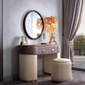
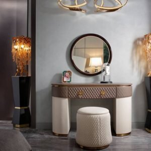
The mirror above a console is the most commercially powerful styling investment available to a showroom or designer. A well-chosen mirror — appropriately scaled, with a frame that reinforces rather than competes with the table below — transforms a standalone furniture piece into a complete vignette. It doubles the visual impact of the styling, amplifies light, and creates a depth that photographs dramatically.
For distributors and showrooms, a coordinated console-and-mirror specification is also a natural upsell: a client who arrives intending to purchase a console table and leaves with a console and mirror pair has increased her order value by 40–80% in a single transaction. The mirror is often easier to sell than the table — its visual and functional impact is immediately obvious — and the combination creates a design result that neither piece achieves alone.
Oversized artwork — a single large-format canvas, print, or photographic work positioned centrally above the table — performs a similar function with a different aesthetic register. Where a mirror creates glamour and spatial expansion, artwork creates intellectual and cultural depth. For design-forward residential clients and luxury hospitality projects, a curated artwork selection above the console is the statement that signals genuine design investment rather than showroom styling.
Color Theory for Console Styling: Creating Cohesion Across Your Showroom
Monochromatic Elegance vs. Curated Color Stories
Monochromatic console styling — objects in a single colour family, varied in material and texture — is the most reliably successful approach for luxury positioning. A display of white, cream, and ivory objects in varying materials (marble, linen, bone, high-gloss lacquer, matte ceramic) reads as sophisticated and deliberate, and tolerates a wide range of surrounding room palettes.
Curated colour stories — two to three intentional accent colours woven through the objects on the display — create a stronger visual personality but require more design confidence to execute without reading as contrived. The rule is that accent colours should echo something already present in the wider room: a cushion, a rug tone, a timber finish. When the colour story connects the console display to the room at large, it reads as intentional. When it exists in isolation, it reads as arbitrary.
Using Neutrals as a Selling Point to Risk-Averse Clients
For B2B clients — particularly hotel procurement directors and developers — the neutral approach is commercially strategic. Neutral-palette console styling photographs consistently well across lighting conditions, ages gracefully as surrounding finishes evolve, and requires fewer seasonal updates than colour-forward arrangements.
Frame neutrals not as the safe choice but as the professional choice. “A neutral foundation gives you flexibility as the brand aesthetic evolves, and it photographs consistently well across all your marketing materials” is a more compelling argument for a procurement director than “it goes with everything.”
Scale and Proportion: Why Your Anchor Piece Makes or Breaks the Display
The Golden Ratio in Console Styling
A console table 140cm wide pairs most naturally with a mirror or artwork 90–100cm wide — approximately 65–70% of the table width. This proportion creates visual alignment without exact symmetry, allowing the backdrop element to anchor the display without appearing to dominate the surface or, conversely, float above it without connection.
For a 160cm console table, the ideal backdrop element is approximately 99cm wide. For a 120cm piece, approximately 74cm. These are calibration guides — practical starting points that can be adjusted based on ceiling height, wall width, and surrounding architecture — but they prevent the most common proportion error, which is selecting a backdrop element that is either too small (reads as an afterthought) or too wide (dominates the surface and reduces the table to a shelf).
Common Mistakes Designers Make When Selecting Statement Pieces
The most frequent error is selecting statement pieces at the wrong scale — objects that look impressive in isolation but are overwhelmed by or overwhelm the table when placed in context. The solution is always to bring the table dimensions to the supplier or showroom and select against specific measurements rather than impression.
The second most common error is selecting multiple competing anchors — a large mirror AND a tall sculptural lamp AND an oversized artwork, all at similar visual weight. The result is visual noise rather than composition. Every display needs a clear visual hierarchy: one primary anchor that the eye reaches first, and secondary elements that support rather than compete with it.
Layer 3 — The Refinement Layer (The Finishing Details)
Styling with Accessories That Communicate Luxury
The refinement layer is where most amateur styling stops — it is the accumulation of small objects that fill the surface. Professional styling treats the refinement layer as the signature layer: the place where the designer’s genuine aesthetic sensibility is expressed at a scale that requires close approach to appreciate.
At distance, a console display is read by its proportions and its anchor piece. At 1–2 meters, it is read by its material combination and overall composition. At arm’s reach, it is read by the quality, character, and curated selection of the refinement objects. A display that rewards close inspection communicates design authority in a way that no amount of distance staging can replicate.
Books, Candles, and Vessels: The Trifecta of High-End Styling
These three categories of object have endured in professional console styling for decades because they each perform a specific function that no other object category replicates.
Art and architecture books (stacked horizontally, never vertically, typically in twos or threes with their spines consistent or deliberately varied) communicate intellectual engagement with design, architecture, and culture. They signal that the space belongs to someone who reads, who travels, who has a point of view beyond the purely visual. A stack of three oversized monographs — a photographer, an architect, a fashion house — with a small sculptural object placed on top is one of the most reliable high-perceived-value styling arrangements available at any budget.
Candles and candleholders introduce scale variation and material diversity. A single tall pillar candle in a heavy stone or cast-metal holder reads as architectural; a cluster of low votives in varying heights reads as intimate. Both add the suggestion of a living, inhabited space — which is precisely the emotional quality that distinguishes a luxury residence from a showroom.
Vessels and sculptural objects are where individual curatorial sensibility is most visible. A single ceramic vessel of genuine character — hand-thrown, with material interest in the glaze or form — communicates design discernment that a mass-produced decorative object cannot. For distributors and showrooms, investing in a small rotating collection of distinctive vessels from craft makers is one of the highest-return styling investments available.
Botanical Elements: Why Fresh vs. Faux Matters to Your Design Narrative
For showroom contexts: high-quality preserved botanicals — dried pampas, preserved eucalyptus, dried cotton stems, organic branch structures — perform the function of fresh flowers with greater longevity and without the maintenance overhead. The key is selecting botanical elements with genuine texture and scale interest rather than the mass-produced preserved arrangements that read as supermarket rather than studio.
For residential design projects: fresh botanicals — a single stem orchid, a sculptural branch, a bowl of seasonal fruit — add the one quality that no other styling element provides: the signal that the space is genuinely inhabited and cared for. That signal is what separates a luxury home from a luxury showroom.
The design narrative is: real botanical elements say someone lives here with taste. Quality preserved elements say someone designed this carefully. Neither is wrong — they serve different commercial contexts.
Texture and Material Mixing: The Professional Designer’s Secret
Pairing Wood, Metal, Glass, and Ceramic for Maximum Impact
A console table display composed entirely of objects in a single material reads as undifferentiated. The professional formula is to introduce at least four distinct material textures, each in a single object or material family, creating a tactile conversation across the surface.
| Material Pairing | Visual Effect | Best Applied With |
|---|---|---|
| Raw timber + polished brass | Warm grounding + refined gleam | Transitional, traditional styles |
| Matte black ceramic + clear glass | Graphic contrast + visual lightness | Modern, industrial styles |
| Linen/fabric + stone/marble | Organic softness + architectural weight | Farmhouse, modern styles |
| Aged bronze + bleached wood | Patinated depth + natural calm | Eclectic, luxury traditional |
| White marble + dark steel | Classical cool + contemporary edge | Modern luxury styles |
The rule is contrast through texture, not through colour. Texturally varied objects in a narrow colour palette read as curated and sophisticated. Texturally similar objects in multiple colours read as accumulated and busy.
How Material Choice Influences Client Perception of Price Point
Material combination is the single most powerful tool for managing perceived price point without changing the actual cost of the display. A group of objects in matte finishes — unglazed ceramic, raw linen, brushed metal, natural timber — reads as considered and premium even when the individual items are modestly priced. The same items in high-gloss finishes may read as cheaper depending on their quality level, because high-gloss finishes expose surface imperfections rather than absorbing them.
This principle has direct commercial implications for your clients: help them understand that a $120 hand-thrown matte ceramic vessel reads as more luxurious than a $180 high-gloss mass-produced vase, and you have given them knowledge they will apply to every project — and that they will credit to your design expertise.
The Art of Negative Space in the Refinement Layer
Why Less Is More When You’re Selling Luxury
The refinement layer’s paradox is that more objects reduce rather than increase the perceived luxury of the display. Each additional object added beyond the formula’s requirements increases visual noise and reduces the impact of every object already present.
The professional discipline is editorial subtraction: after the display is styled, remove one object. Then evaluate. Remove another. Evaluate again. The display is correctly edited when removing one more object would create an imbalance, rather than an improvement.
For showroom staff training, this editing exercise is the most valuable single practice. It takes approximately three sessions before team members genuinely internalise the principle that restraint is a choice, not a failure of imagination.
Strategic Grouping: The Rule of Three and Why It Works
O Rule of Three is the most consistently reliable grouping principle in interior styling — objects arranged in groups of three create a natural visual hierarchy (one tallest, one mid-height, one lowest) that the eye reads as balanced without being static. The principle functions because three is the minimum number of objects required to create a visual triangle — the most stable compositional shape — while still allowing each element to be perceived individually.
Applied to a console table, the Rule of Three typically manifests as: three major groupings on the surface (each containing its own sub-elements), three distinct height levels within each grouping, and three dominant material textures across the full display.
🎥 Watch: Console Table Styling Ideas for a Cohesive and Elevated Look
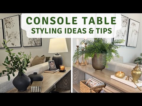
A professional walk-through of elevated console table styling principles — directly applicable to showroom displays, residential projects, and hospitality staging. Useful for team training and for sharing with design clients as a visual brief supplement.
Adapting the Formula Across Different Interior Styles
Modern Minimalist Console Styling
How to Sell Simplicity as Sophistication to Your Clients
The modern minimalist console presents the most demanding styling challenge because every element is fully exposed: there is nowhere to hide an incoherent object or an awkward proportion. This is precisely why it is the most powerful demonstration of design expertise when executed correctly — and the most compelling display for design-forward professional buyers.
A minimalist console display styled with three objects — one large-scale architectural lamp, one small ceramic bowl in a single tone, and a single art book in a complementary colour — tells a more confident design story than a console covered with twenty carefully chosen pieces.
For clients who resist minimalism as “bare” or “cold,” the reframe is: “This approach gives each piece room to be itself. The lamp you’re considering is genuinely interesting — it deserves the space to be seen rather than being competed with by a dozen neighbours.”
Product Selection Strategy for Contemporary Showrooms
For contemporary showrooms, the highest-performing display strategy is to let the table surface communicate the table’s quality rather than obscuring it. A marble-topped modern console, styled with minimal objects, shows the stone’s character, the base’s construction detail, and the quality of the finish — all of which are direct sales arguments for the piece itself.
Avoid overstylising luxury table surfaces. A $4,500 Calacatta marble console top is not improved by covering it with objects; it is improved by a single sculptural ceramic that invites the eye to the surface and then invites it away, to return to the marble.
Traditional and Transitional Console Displays
Layering Ornament Without Appearing Dated
Traditional console displays accommodate more ornamentation than modern ones — but the same fundamental principles apply: hierarchy, proportion, and intentional negative space. The difference is in the vocabulary of the objects: candlesticks rather than architectural lamps; carved wooden objects rather than ceramic vessels; books with gilt-edged covers rather than minimalist linen covers.
The trap in traditional styling is symmetry overload: an exactly mirrored arrangement of identical candlesticks, identical frames, and identical flower arrangements reads as a display window rather than a designed space. Introduce subtle asymmetry — one candlestick slightly higher, one book stack rather than two — to suggest personality rather than formula.
How to Appeal to Conservative Clients While Maintaining Design Credibility
For conservative residential clients and traditional hotel brands, the styling formula should feel familiar but refined. Use classic object categories — framed photography, silver or bronze candleholders, fresh white peonies or dried roses — but select individual examples with genuine design quality rather than mass-market predictability.
A carved wooden candleholder from a craft maker looks different from a mass-produced resin imitation, even in the same colourway. The client may not be able to articulate why one reads as expensive and one reads as department store — but they will feel it, and that feeling is the basis of their purchasing decision.
Eclectic and Bohemian Approaches
Controlled Eclecticism: Making Diverse Pieces Look Intentional
Eclectic console styling is the most technically demanding approach because the organizing principle is not obvious. A successful eclectic display contains objects from apparently diverse sources — a Japanese ceramic vessel, an African-influenced brass candleholder, a European art book, a raw linen runner — that are held together by a coherent material or colour thread running through them.
That thread is what distinguishes a curated eclectic display from a random accumulation of interesting objects. Before any eclectic display is considered styled, identify the connecting thread and be able to articulate it: “These objects share a common relationship between raw and refined — each one has both a natural material and a crafted treatment.” If the thread cannot be articulated, the display is not ready.
Luxury Hospitality Console Styling
Creating Displays That Set the Tone for High-End Hotel Spaces
Hotel lobby and corridor console styling operates under commercial constraints that residential styling does not: the display must perform visually from 10 meters, withstand guest contact, maintain its appearance across 18-hour operational days, and require minimal maintenance intervention.
This means that the botanical elements must be preserved or high-quality faux, that the objects must be weighted or fixed to prevent casual displacement, that the surface treatment must withstand commercial cleaning products, and that the overall visual impact must be achievable consistently by housekeeping staff following a restaging brief rather than a designer visiting weekly.
O standard hotel lobby console specification positions the table at 800–900mm height, selects a primary anchor mirror at 120–140% of the table width, and uses no more than three styling objects to minimize maintenance complexity while maintaining visual impact.

Hotel console styling must balance visual impact with operational simplicity. The most successful hospitality displays achieve maximum impression with minimal objects — because minimal objects means minimal maintenance and consistent reset across every shift.
Durability and Maintenance Considerations for Commercial Clients
For hospitality clients, the durability conversation is as important as the aesthetic one. Object selection for hotel console styling should consider: weight (light objects migrate and get displaced); surface material (porous surfaces absorb spills and cleaning products); scale (small objects disappear and are replaced inaccurately); and cleaning compatibility (avoid finishes that react to commercial-grade disinfectants).
Build a maintenance brief into every hospitality console specification: a one-page document with a photograph of the completed display and clear restaging instructions that housekeeping management can follow without design expertise.
Practical Implementation for Your Design Business
How to Train Your Showroom Staff to Use This Formula
Creating a Visual Reference Library for Your Team
The most effective training tool is a visual reference library: a curated collection of photographs showing the three-layer formula applied correctly across all five console table styles, at different price points, in different spatial contexts. This library should include correctly styled examples and deliberately incorrect examples (over-styled, under-styled, poor proportion) with annotated explanations of what differentiates them.
Build the library in a shared digital folder accessible to all showroom staff. Update it quarterly with new display photographs. Use it as the reference point in team meetings: “Let’s look at the library and identify what we can improve in our current display.”
Translating the Three-Layer Formula Into Sales Conversations
The formula is also a sales script. When a client stands in front of a console display and asks “how did you achieve this look?”, a staff member who can walk them through the three layers — “we started with the proportional foundation, then selected this mirror as our primary anchor, and then refined the surface with these three material textures” — is demonstrating design expertise and simultaneously selling the table, the mirror, the ceramic vessel, and the art books.
That demonstration, when it translates to a transaction, typically increases the average order value by 40–80% compared to a single-piece sale. According to HFA’s visual merchandising guidance, showrooms that invest in styled room displays and train staff to articulate the design rationale consistently outperform those using product-only displays in both conversion rate and average transaction value.
Building Console Displays That Convert Clients Into Larger Projects
Using Console Styling as a Gateway to Whole-Room Design Commissions
A console display styled to a professional standard is not an isolated vignette — it is a proof of concept. A client who responds to a console display with “I want my entire living room to feel like this” has just opened a commission conversation. That conversion from single-piece interest to whole-room commission is the highest-value outcome of investment in professional display styling.
Train your team to bridge this gap deliberately. “Everything you’re responding to in this display — the material combination, the proportional restraint, the material quality — we can apply this design logic across your entire project. Would it be useful to talk about what that might look like?”
Photography and Presentation: Documenting Your Work for Portfolio Impact
A professionally styled console display is a marketing asset as well as a sales tool. Photograph every display at three levels: full-room context (showing the table in its spatial relationship to surrounding furniture), mid-range composition (the primary styling vignette), and detail close-ups (the material quality and refinement layer).
These photographs serve multiple commercial purposes: Instagram and LinkedIn content that demonstrates your design expertise, portfolio assets that support your pitch for new design commissions, and supplier relationship documentation that demonstrates how well their products perform when styled correctly — a useful conversation with the manufacturers and distributors you work with.
Case Studies and Real-World Applications
Case Study 1: How a Mid-Size Showroom Increased Project Values by 35% Using Styled Displays
A mid-size showroom in Singapore began systematically applying the three-layer formula to all console table displays in late 2023, having previously displayed tables in isolation with minimal styling. They invested approximately $2,800 in styling accessories across eight displays — averaging $350 per display — and committed to a staff training program covering the formula and the sales language to accompany it.
Within two quarters, the average transaction value for clients who engaged with styled displays increased by 35% compared to the previous period. The primary driver was the increased frequency of mirror and artwork add-on sales alongside console table purchases — a direct result of the integrated display approach and the trained sales conversation.
The total styling investment of $2,800 generated incremental revenue of approximately $41,000 in the six months following implementation, across the 18 transactions that involved styled display engagement. That is a 1,364% return on the styling investment in a single six-month period.
Case Study 2: Translating Console Styling Knowledge Into Hotel Fit-Out Design Success
A hospitality interior designer in Kuala Lumpur was pitching for a full FF&E specification for a 92-room boutique hotel. Her presentation included professionally styled console table mock-ups for lobby, corridor, and suite applications — each demonstrating the three-layer formula adapted to the hotel’s brand language of “contemporary heritage.”
The procurement committee’s feedback was specific: the console table presentations were the most convincing element of the pitch because they showed, concretely, how the design language would function at the scale of individual furniture moments rather than only at the architectural scale. The designer was awarded the project.
The console mock-ups cost her approximately $180 in styling accessories and four hours of preparation time. The project value was $340,000 in specification commissions and $86,000 in direct furniture supply.
Case Study 3: Using the Three-Layer Formula to Differentiate Design Services from Competitors
An interior designer in Hong Kong was competing against three larger firms for a luxury residential commission — a 280sqm penthouse. Her presentation differentiated on one specific element: she included a console table styling consultation as part of her design services scope, framed as a “design intention demonstration” that she would provide for every key piece in the project.
The client — a corporate executive with limited interior design experience — responded to this element more strongly than any other aspect of the pitch. The tangibility of understanding exactly how each piece would be styled and presented gave her confidence in the designer’s vision that the more abstract portfolio presentations of larger competitors did not provide.
She was awarded the commission. Her fees were 22% higher than the lowest competing bid.

Every well-executed console display is simultaneously a proof of design capability and a sales platform. The client who asks “how did you achieve this?” is beginning a commission conversation, not just paying a compliment.
Advanced Styling Techniques for Premium Projects
Lighting Considerations: How to Highlight Your Console Displays
Task Lighting vs. Ambient Lighting in Showroom Settings
Lighting is the styling element that costs nothing to adjust and changes everything about perceived quality. A console display under cold fluorescent overhead lighting loses 50–70% of its visual impact. The same display under warm directional spotlighting — 2,700–3,000K colour temperature, positioned to cast controlled shadows that define the sculptural quality of objects — can look genuinely museum-quality.
Task lighting from an architectural table lamp on the display surface serves two functions: it adds a styling element of genuine visual scale, and it creates a pool of warm light that lifts every nearby object’s material quality. A lamp casting a warm circle of light across a marble console top makes the stone glow in a way that overhead lighting cannot replicate.
Accent lighting from directional spotlights in the ceiling or track system, aimed at 30–45 degrees from vertical, creates the shadow definition that makes the difference between a flat arrangement and a three-dimensional composition. For showrooms with existing lighting infrastructure, repositioning ceiling spotlights to target console displays specifically is a zero-cost improvement that can have immediate impact on client response.
Creating Mood Through Strategic Illumination
The emotional register of a console display changes fundamentally with lighting temperature. Warm lighting (2,700K) creates intimacy, luxury, and residential comfort — the right register for high-end residential and boutique hospitality. Cooler lighting (3,500–4,000K) creates precision, clarity, and contemporary confidence — more appropriate for design-forward commercial and contemporary residential contexts.
For showroom operators, the practical recommendation is to invest in dimmable warm LED fixtures targeted at your primary console display positions. The difference in client response to a display at 2,700K with 35% dimming versus the same display at full overhead fluorescent is not subtle — it is the difference between “I like this” and “I need this.”
Seasonal and Trend-Based Updates
Keeping Displays Fresh Without Complete Overhauls
The cost of maintaining perpetually current console displays is manageable when the update approach is additive rather than comprehensive. The anchor pieces — mirror, primary sculptural vessel, lamp — can remain constant for 12–18 months without the display reading as stale. It is the refinement layer that should be rotated: books swapped for new titles, botanical elements changed to reflect the current season, smaller objects exchanged for fresh selections.
The four seasonal refresh points that generate the highest client engagement and social media interest are: early spring (fresh botanicals, lighter textures, brighter neutrals), late summer (dried botanicals, warm terracottas, raw linen), autumn (darker tones, richer textures, stone and bronze), and winter/holiday (candlelight, greenery, warm metals).
Each seasonal refresh requires a maximum of four new styling objects per display, at a total cost of $60–$150. The return in repeat visitor engagement, social content, and client referrals significantly exceeds this investment.
The Role of Scent and Sensory Experience
Creating Multi-Sensory Luxury Experiences in Showrooms
Luxury is a multi-sensory experience. A showroom that smells like a luxury hotel lobby — subtle, warm, unmistakably considered — creates a sensory environment that primes clients to perceive the furniture within it as premium. That priming effect is not marketing hyperbole; it is documented sensory marketing science.
Console table displays are the natural placement point for subtle fragrance: a reed diffuser concealed behind a book stack, a candle whose scent is consistent across all showroom displays, a small botanical arrangement with natural scent. The fragrance should be subtle — detectable without being identifiable, a background note rather than a statement.
For hospitality design clients specifying for hotel lobbies and corridors, the scent element is worth raising explicitly: many luxury hotel brands have signature scents that their designers are asked to reference in the FF&E specification, and your awareness of this detail positions you as a sophisticated hospitality design partner.
Measuring Success and ROI
Key Metrics for Evaluating Your Console Display Strategy
Invest in styled displays only if you are willing to measure whether they are working. Without measurement, you have decoration; with measurement, you have a system.
Client Engagement Rates and Conversion Tracking
| Métrico | How to Measure | Target Benchmark | Warning Signal |
|---|---|---|---|
| Display engagement rate | % of showroom visitors who interact with (stop at, photograph, ask about) styled displays | >60% | Below 40% |
| Styled display inquiry rate | % of styled display engagements that generate a product inquiry | >35% | Below 20% |
| Multi-piece transaction rate | % of console table sales that include at least one additional piece from the display | >45% | Below 25% |
| Average transaction value (styled vs. unstyled) | Comparison of average order value for clients who engaged with styled displays vs. not | +30–40% premium | Below 15% premium |
| Photography engagement | Social media engagement on styled display photography vs. product-only photography | >2x | Below 1.5x |
How Styled Displays Impact Average Project Values
Track a six-month baseline before implementing systematic three-layer styling, then track the same metrics for six months post-implementation. The comparison will show the direct revenue impact of the investment. Based on industry benchmarks from HFA showroom data and specialist furniture retail analysis, showrooms implementing professional styled display programs typically see 15–35% increases in average project values within six months of consistent execution.
The ROI calculation is straightforward:
Feedback Loops: Using Client Response to Refine Your Approach
What Questions Clients Ask About Styled Displays
Track the questions clients ask about styled displays — the specific objects they ask about, the styling elements they reference, the aspects they want to replicate in their own projects. This data tells you both which elements of your formula are working commercially and which pieces in your styling inventory should be moved to the active sales catalog.
An object that generates three client inquiries per week in a styled display context is an object that should be available for sale, properly priced and documented in your catalog. The display has done its market research for you.
Using Client Feedback to Inform Inventory Decisions
Build a simple logging protocol: after every client interaction with a styled display, record the objects that generated comment or inquiry. After 90 days, you will have a ranked list of your highest-engagement styling objects. Cross-reference against your current inventory depth to identify: objects that should be stocked more heavily (high engagement, often available for sale); objects that should be sourced more consistently (high engagement, currently single pieces); and objects that are not generating interest despite styling investment.
Troubleshooting Common Console Styling Challenges
Problem: Displays That Look “Too Busy” or Cluttered
Diagnostic Questions to Ask Yourself
Before removing any objects, diagnose: Is the problem too many objects, or the wrong height variation? Too many objects at the same height create clutter. The right number of objects at varying heights create composition. Count your objects first, then check whether they form a visual triangle from your primary viewing distance.
A display with seven objects at three distinct height levels, in two material families, with 60% negative space is not cluttered — it may simply need the negative space to be more deliberately distributed. A display with three objects at the same height and no visual triangle is cluttered in spirit even if sparse in number.
Quick Fixes Without Complete Restaging
Remove the smallest two objects from the display and evaluate immediately. In 80% of cases, removing the objects that seemed like additions but are functioning as noise resolves the busy reading without requiring a full restage. If the display still reads as cluttered after removing the two smallest elements, remove the third smallest and re-evaluate. The goal is to identify the exact edit point where the display tips from “full” to “composed.”
Problem: Difficulty Sourcing the Right Pieces at the Right Price Points
Alternative Sourcing Strategies for Distributors and Agents
The most reliable alternative sourcing strategy for styling accessories is the adjacency approach: identify the artisan and craft markets, estate sale dealers, and boutique import stores in your city that serve the same aesthetic territory as your furniture offering. These sources provide access to distinctive, non-mass-produced pieces at price points that support your styling budget without requiring the minimum order quantities of wholesale sourcing.
For distributors building ongoing relationships with consistent styling needs, direct relationships with ceramic artists, textile makers, and bronze casters — established through craft market introductions and artist studio visits — provide a proprietary supply of distinctive pieces that competitors cannot replicate.
Móveis Jade Ant works with project clients to source complementary accessories for complete specification briefs — a service that extends the value of the furniture relationship into the complete room outcome that professional buyers are actually purchasing.
Building Relationships With Artisans and Makers
The relationship model for artisan sourcing is different from the supplier model for furniture sourcing. Artisan makers respond to genuine appreciation of their work, consistent volume (even at small scale), and creative latitude — the opportunity to produce their best work rather than a prescribed copy of something you saw elsewhere.
Invest in these relationships with the same long-term thinking you apply to furniture supplier relationships. The artisan whose ceramic vessels you have been placing on your console displays for three years will produce custom commissions, hold stock for your requirements, and refer other design professionals to your showroom — all outcomes that compound well beyond the value of the individual pieces.
Problem: Displays That Don’t Translate Client Interest Into Actual Sales
The Gap Between “Liking” and “Buying”: Understanding Client Psychology
A client who says “I love this display” and then doesn’t purchase is not a failure of the display — it is a failure of the sales conversation bridge. The display generated desire; the sales process did not channel it.
The bridge statement that converts display admiration into purchase conversation is: “Everything you’re responding to here — the material combination, the way the proportion works, the overall feeling — this is achievable in your project. The console table is the foundation; the mirror and the ceramics complete the picture. Shall we talk about what this looks like for your space?”
That statement does three things: it validates the client’s response, it connects it to their project, and it frames the complete purchase as the vehicle for the outcome they already want. It is the most commercially important sentence your showroom staff can learn.
The Long-Term Value of Mastering Console Styling
How This Skill Positions You as a Design Authority
Mastery of the three-layer console styling formula is not a display skill — it is a positioning strategy. Distributors, showrooms, and design professionals who apply it consistently build a market reputation for design expertise that precedes them in every client conversation.
Interior designers who bring this framework to their client presentations are not pitching furniture. They are pitching a design philosophy — one that clients can see, feel, and understand — and one that positions the designer as a professional whose knowledge creates measurable value.
Hotel fit-out specialists who demonstrate this knowledge in procurement presentations are not winning on price. They are winning on design capability and operational understanding — the combination that justifies premium fees and long-term supply relationships.
Next Steps: Implementing the Three-Layer Formula in Your Business
Begin this week with one display. Choose your strongest console table, apply the formula with deliberate intention, photograph the result, and show it to three clients. Note their responses. Within 30 days, apply the formula to every console display in your showroom or studio, build the visual reference library for your team, and implement the sales language bridges in your client conversations.
Within 90 days, the data will show you what the formula is doing for your average transaction values. The formula compounds: each well-styled display generates content, conversations, and commissions that make the next display more valuable than the last.
Ready to Elevate Your Showroom and Design Projects?
Explore the full console table range at Móveis Jade Ant — available across all five design style categories, with custom dimension, material, and finish options for project-specific requirements.
View Console Table Collection | Explore Living Room Furniture | Contact Our B2B Team
Additional industry resources: HFA Remerchandising Your Showroom Floor | Contravision: Visual Merchandising Statistics | The Golden Ratio in Interior Design
Perguntas frequentes
Q1: How can I use console styling to justify higher design fees to my clients?
The three-layer formula is a professional methodology — and professional methodologies justify professional fees. When you present a console styling consultation as a structured part of your design service scope (not an add-on, but a core deliverable), you give clients a concrete, tangible expression of the design thinking that separates your service from a generic furniture selection. A client who watches you apply the formula — who sees the display transform from a table with random objects into a composed vignette with a clear visual logic — understands in their bones why design expertise has a price. The commercial case for the formula is not that it makes displays look better; it is that it makes your design judgment visible, demonstrable, and defensible at every client touchpoint.
Q2: What is the minimum budget needed to create a luxury-looking console display for a showroom?
The formula works at $300–$800 per display, and the result will read as having cost two to three times that amount if the formula is applied correctly. The investment breakdown: $120–$180 for a primary anchor object (a quality ceramic vessel, a distinctive book stack, or a small sculptural piece), $80–$150 for secondary refinement objects (two to three smaller accessories in complementary materials), and $60–$120 for botanical elements. The mirror or artwork behind the table is ideally a permanent investment that is amortized across multiple display iterations — an $800 vintage or quality reproduction mirror serves as the backdrop for six seasonal display refreshes, making its cost per display approximately $130. The critical principle is that the perceived value comes from curation and proportion, not from individual piece price points.
Q3: How often should I refresh my showroom console displays?
Refresh the refinement layer (botanical elements, small accessories, books) monthly — a 30–45 minute exercise costing $60–$120 that generates fresh photography content and signals to repeat visitors that your showroom is actively curated. Refresh the statement layer (anchor objects, secondary vessels) seasonally, four times per year. Refresh the foundational layer (the console table itself and its primary backdrop) annually or when you introduce significant new inventory. This graduated refresh schedule maintains perpetual visual currency without the cost or disruption of complete display overhauls.
Q4: Can the three-layer formula work for different design styles, or is it only for modern spaces?
The formula is universal because it operates at the level of structural principle rather than aesthetic vocabulary. Foundation, statement, and refinement are design imperatives that apply equally to a minimalist modern display, a richly ornamental traditional arrangement, and a controlled eclectic composition. What changes across styles is the specific objects used in each layer — a traditional display uses carved candlesticks where a modern display uses architectural ceramics — but the underlying structure is identical. This universality is what makes the formula teachable and scalable: once a team member understands the principle, they can apply it across every aesthetic context without needing separate guidelines for each style category.
Q5: How do I know if my console display is actually converting browsers into clients?
Track two immediate metrics: the percentage of showroom visitors who stop and interact with (not just pass) a styled display, and the percentage of those interactions that generate a product inquiry. Photograph each display on your social media and track engagement rates versus your product-only photography. Ask your team to record, at the end of each day, which displays generated conversation and what questions those conversations included. Within four to six weeks you will have enough data to identify which displays are working commercially and which are generating admiration without converting. Admiration without conversion usually indicates a sales language gap rather than a display quality gap — the bridge from “I love this” to a purchase conversation is the fix needed, not the display itself.
Q6: What is the difference between styling a console for a retail showroom versus a hotel fit-out project?
Showroom styling prioritises visual aspiration and design demonstration — the goal is to generate desire and stimulate purchase conversations. Hotel styling prioritises operational durability and maintenance simplicity alongside visual impact — the goal is to create an impression that sustains itself through 18-hour operational days, weekly cleaning cycles, and daily guest interaction without requiring designer intervention. In practical terms: showroom displays can use fragile, precious, or high-maintenance objects because a trained team manages them daily; hotel displays should use weighted, cleanable, and resilient objects because housekeeping manages them without design expertise. The formula remains the same; the object specification within each layer changes completely.
Q7: How can I train my team to style consoles consistently without me doing it all?
Build a visual library showing the formula correctly applied across at least twelve examples, across all five console style categories, at varying price points. Annotate each example with explicit notes: “This display works because the anchor mirror is 68% of the table width, the height variation spans 40cm from lowest to tallest element, and the three material textures (marble, brass, linen) create contrast without competition.” Run monthly team exercises where staff members style a display from scratch using the formula and explain their reasoning. Consistency comes from understanding why the formula works, not from memorising specific arrangements. A staff member who understands the principle can create a correct display from any available objects; one who has memorised a specific arrangement cannot adapt when the inventory changes.
Q8: Should I invest in expensive statement pieces or use budget-friendly alternatives?
Invest strategically in one to two pieces per display that justify premium positioning — typically the primary anchor piece, because it is the element that clients register first and remember longest. Fill the refinement layer with budget-friendly items selected for material quality and design character rather than brand or price. A $380 hand-thrown ceramic vessel as the anchor, surrounded by $35–$60 refinement objects selected for material coherence, reads as a $1,200 display. The reverse — a $25 mass-produced vase as the anchor with $200 accessories — reads as confused and incoherent regardless of total spend. Invest at the top of the visual hierarchy; economise at the detail level.
Q9: How do I prevent console displays from looking staged or artificial?
The staged quality comes from three sources: excessive symmetry (which reads as deliberate arrangement rather than lived design), too many objects of identical type (three matching candlesticks rather than one candlestick, one vessel, one sculptural object), and the absence of any element that suggests personal taste rather than generic styling. Introduce one unexpected element per display — an art book whose subject matter reflects a genuine aesthetic interest, a ceramic piece from an unfamiliar maker, a botanical element that is slightly unconventional. This element is the one that signals curation rather than formula, and it is the element that experienced design clients will notice and respond to as evidence of genuine design sensibility.
Q10: Can console styling help me compete with larger design firms?
Console styling — and the three-layer formula specifically — is an area where smaller operations have a structural advantage over larger firms. Larger firms move more slowly, standardise their approach across more projects, and often delegate styling to junior team members. Smaller firms and specialist showrooms can move faster, develop more distinctive visual signatures, and demonstrate their aesthetic sensibility more personally and specifically. The three-layer formula is not a levelling tool — it is an amplifier of individual design capability. The designer who applies it with genuine aesthetic conviction creates displays that reflect their specific design vision; the designer who applies it formulaically creates competent but generic results. Your competitive advantage lies in the vision you bring to the formula, not in the formula itself.
Q11: What is the best way to photograph console displays for portfolio and marketing?
Photograph at three distances: full-room context (the console in its spatial relationship to the wider room — essential for showing how the display anchors the space and for client imagination of their own rooms), mid-range composition (the primary vignette at 2–3 meters, showing the complete styling arrangement in its proportional relationship to the wall backdrop), and detail close-ups (the material quality of individual objects at arm’s reach, showing the texture, finish, and craft quality that is invisible at distance). Use natural sidelight when available — it creates the shadow definition that makes three-dimensional objects read with depth. Avoid photographing directly into a mirror; position the camera at 30–45 degrees to the mirror surface to capture depth and reflection without lens distortion.
Q12: How do I handle it when a client wants to buy a piece from my display?
This is the highest possible validation of your styling work. Have a protocol ready: if the object is available for sale, know its price and lead time immediately (not “let me check”) — the client’s desire is at its peak in the moment of wanting, and any friction in the purchase process risks losing the conversion. If the object is a styling accessory rather than catalog inventory, source it for the client immediately and add it to their order alongside the console table. If the object is not available for sale, use the moment to redirect: “That piece is part of our display, but I can show you three similar options that would work as beautifully in your space.” A client who wants to own a piece from your display is a client who trusts your design judgment — that trust is the foundation of a long-term relationship, and it begins with your immediate, confident response to their desire.
Q13: What is the ROI on investing time and resources into console styling?
The most reliable ROI figure from furniture showroom styling investments is a 15–35% increase in average project values, achieved within six months of consistent three-layer formula application. The compounding returns extend beyond direct transaction value: portfolio photography that generates new client inquiries, social media content that builds design authority positioning, and staff development that reduces dependence on senior team members for client conversions. The investment required — $300–$700 per display in accessories, 2–4 hours per display in styling and photography time — is recoverable from a single additional add-on sale per display per month. The return on that investment compounds indefinitely as the displays generate ongoing client engagement, repeat visits, and referrals.
Q14: How do I source unique pieces for console displays without breaking my budget or inventory?
The most consistent and commercially productive approach is to build a small standing collection of styling objects — 40–60 pieces across all five style categories — that rotate across displays rather than being permanently assigned to any single one. This rotation strategy maximises the perceived variety of your displays at a fixed asset cost, because the same high-quality ceramic vessel that anchors a modern display this month can become a refinement object in a transitional display next month. Supplement this core collection with seasonal acquisitions from estate sales, craft markets, and artisan direct relationships — targeting distinctive pieces that cannot be identified as mass-market and that justify client inquiry.
Q15: Is console styling relevant for designers working primarily on residential projects, or is it mainly for showrooms?
Console styling is arguably more commercially valuable for residential designers than for showrooms, because residential designers can apply the formula directly to client homes as a service differentiator rather than as a showroom display investment. A residential designer who walks a client through the three-layer formula in the client’s own entry hall — using the client’s own objects, reorganised according to the principle — delivers a tangible, immediate transformation that the client experiences in their own home and attributes directly to the designer’s expertise. That attribution is worth more than any portfolio case study, because the client lives with the evidence of the designer’s value every time they enter their own front door. For residential designers, the formula is not a display technique — it is a relationship-deepening service that justifies ongoing engagement and referrals.
For more resources on luxury furniture styling, console table sourcing, and B2B design support, visit JadeAnt.com. Industry references: HFA Visual Merchandising Guide | Contravision Visual Merchandising Statistics | Fortune Business Insights Console Table Market